
I was in a somewhat unfamiliar part of downtown Saint Paul today, which was a chance to see my city as if I were an outsider. First I saw these two while I was walking along the street:
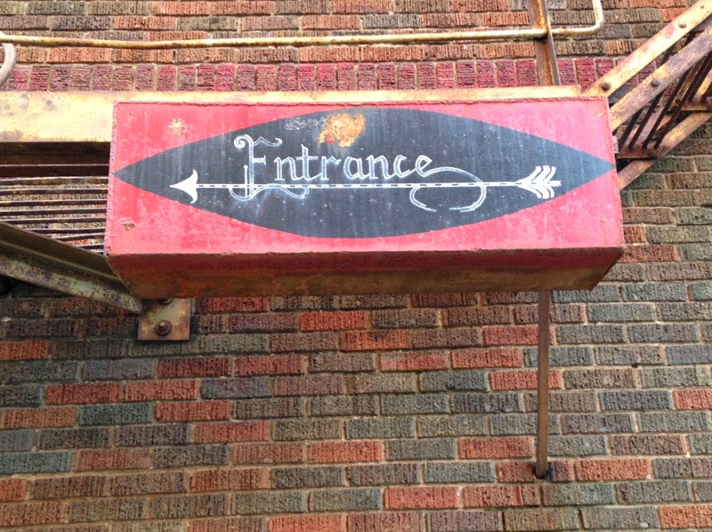
Funky and fun!
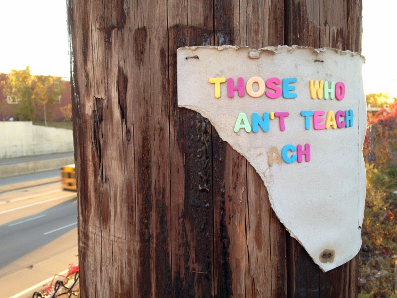
I'm not sure what this sign maker was trying to say, but the remnant was amusing.
And then there was this banner from inside the carpenters' union hall:
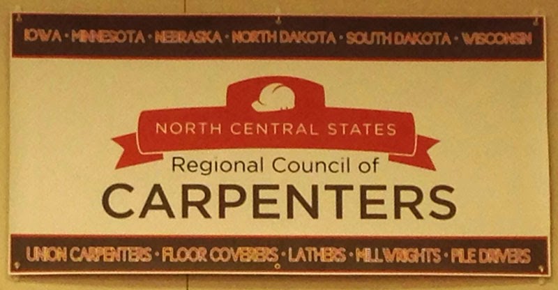
The reason this one ended up in my post is because of the way the smaller type looks. The designer wanted to use thick horizontal brown bars at the top and bottom, and wanted the state names and skill areas to be centered inside the bars. The words were done in red in a fairly light-weight font.
I'm assuming the contrast between the red type and brown background looked okay on screen. But when they went to print the banner, somebody realized there wasn't enough contrast. Good call.
The problem arose when s/he decided to fix the problem by putting a white stroke around each of the red letters. This not only makes the words very busy and cluttered, it causes them to crash together because the space that used to exist between the letters is now filled with a white line.
The result is pretty much unreadable. A better decision would have been to abandon the idea that the words needed to be red, and just turn the type to white.
Better read than red.
Saturday, October 25, 2014
Three Signs in Saint Paul
![]()
![]()
Subscribe to:
Post Comments (Atom)

1 comment:
Perhaps from George Bernard Shaw Man and Superman. Those who can, do. Those who can't teach. Written well before Fix News tried to popularize it. :(
Post a Comment